Site Rewrite
Welcome to my first blog. Please don’t judge me if it looks awful - I did it for the first time, lol.
The topic about this blog is: Site Rewrite.
So.. I’ve decided to rework my site, to get some new style for it - which I like.
The old style
The site’s old base was based of Pk11’s site. It was a good start to get a GitHub page that was alright, however at the end, I did feel like using a other site’s base that wasn’t made on my own wasn’t that nice after all. It was mostly a copy-paste of a template first with some modifications for my site, which worked alright - but after some time it did feel like I’m not being able to do my own.
Over the time I’ve got some more experience with HTML, CSS, JS and that stuff and was able to do quite a bit on my own (See the Sim2Team sites as an example). Pk11 of course helped some bit on it - but I’ve got definitely better with HTML and such.
Here is a screenshot of the old site’s style: 
What changed over the rewrite?
There are actually quite some changes that I’ve made. One of those being the use of some kind of sidebar style for the whole site. Personally I kinda like that, as having the full width of the site kinda feels like there is too much space that is being unused.
The rewrite is definitely not fully done yet and I may continue on it when I find the next proper time for it.
Here are some of the changes listed:
- Changed from full-width site style to half-width site style by having a sidebar on the left side of the page, and the actual page content on the right side of the page.
- On a phone, the sidebar isn’t actually on the side and instead on the top of the site and the page content is below, that’s in my opinion fine as well.
-
Removed the
StackGamessection of the site, because that’s not really needed. Instead I just have a fullProjectssection that contains all of my personal projects. -
Same goes with
StackJSGames. Because there is onlyLudoJS, it has been moved toProjects. - Currently no themes are available. I may eventually add themes in the future, but for now - the current blue style looks great. The colors are mostly just randomly selected for fun, such as with hex colors:
#123456,#ABCDEFetc.
NOTE: Some things from the Sim2Team sites have been re-used, though because I did most of the sites anyways I at least know what I did instead of using a template from someone else ;P
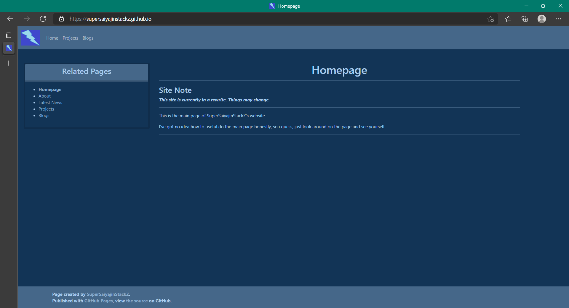
Here is a screenshot of the current site as of the creation of this blog: 
And that is the end of this blog. I don’t know what else to say, but I hope the blog is not too bad. See ya on the next blog or so! ~SuperSaiyajinStackZ - 30 October 2021.